You’ve tuned your rig, dialed in your monitor, and captured the perfect screenshot or generated a stunning AI artwork. Now you want it on your wall—big, sharp, and with the same punch you saw on screen. The catch: what looks great on an HDR, wide-gamut display can print muddy or soft if you don’t prep it correctly.
This guide gives you a step-by-step, PC-friendly pipeline to convert screenshots, renders, and AI images into gallery-grade prints with predictable color and crisp detail. No fluff—just the exact checks and settings to use.
1) Calibrate your display (once, then maintain)
If you’ve never calibrated your monitor, everything downstream is guesswork.
What to do
- Use a hardware colorimeter (e.g., X-Rite/Calibrite) with DisplayCAL or vendor software.
- Target: 6500K white point (D65), gamma 2.2, 120–160 nits for a room with ambient light.
- Disable dynamic contrast, local dimming tricks, and “vivid” modes during calibration.
- Re-calibrate every 1–2 months or when your environment changes (new bulbs, sunlight exposure).
HDR users: Do a separate SDR calibration and keep an SDR reference profile for print prep. You’ll convert HDR captures to SDR later (see §4).
2) Choose the right master: resolution, bit-depth, and noise
Printing exposes flaws that screens hide.
- Aim for 300 DPI at final size. Required pixels ≈ inches × 300.
- Example: a 24×16″ print needs 7200×4800 px (or higher).
- Work in 16-bit when possible (Photoshop/Affinity). You can export 8-bit at the end.
- De-noise first, then sharpen. Use your GPU tools (e.g., Topaz DeNoise, built-in Camera Raw) lightly—over-denoising kills texture.
- For AI images: upscale the master early with a high-quality model (e.g., Lanczos, R-ESRGAN 4x+), then retouch.
Quick check: zoom to 100% and look for banding in gradients or sky. If you see steps, add a tiny bit of dithering or work at 16-bit.
3) Match aspect ratio and plan for bleed
Most gaming screenshots are 16:9; a lot of print sizes are 3:2, 4:3, or 1:1. Don’t let a lab auto-crop your hero moment.
- Decide your final size and ratio first, then crop intentionally.
- If the print requires borderless edges or a canvas wrap, add bleed (commonly 0.125–0.25″ per edge). Keep critical content away from the extreme edges.
- Prefer content-aware or symmetric crop to avoid cutting UI or faces.
Pro tip: Create reusable crops (16×24, 12×18, A-series) as Photoshop/Affinity presets so you can generate a whole wall set consistently.
4) Converting HDR screenshots to SDR (tone mapping that won’t wash out)
Many modern titles and Windows desktops run in HDR. Printers are SDR. If you export an HDR frame as-is, the result can look flat.
- In Photo/Video tools, disable HDR metadata and apply manual tone mapping:
- Lower highlights carefully, raise midtones a touch, and keep blacks near true black (avoid milky blacks).
- Use a filmic curve or a gentle S-curve—avoid crushing shadows that will block up on paper.
- Proof on an SDR-calibrated profile (from §1). Toggle SDR/HDR on your monitor to sanity-check contrast.
5) Color management that survives the printer
Most online labs and print partners accept sRGB and convert to their internal profiles. Some pro labs accept CMYK with specific ICCs. Your goal is predictability, not blind conversion.
- Work in sRGB IEC61966-2.1 unless your lab explicitly provides an ICC profile.
- If the lab provides ICCs and allows soft-proofing:
- Install the profile.
- Enable Soft Proof (Photoshop: View → Proof Setup).
- Toggle Gamut Warning and adjust overly saturated colors (neon HUD elements, bright skies).
- Avoid extreme near-neon greens/cyans—they clip badly to paper.
- If you ever convert to CMYK, do it last, and only with the printer’s recommended ICC.
Reality check: What looks blazing on a QD-OLED may not exist in inks. Soft-proofing lets you see that before you pay for it.
6) Smart upscaling and sharpening (avoid the “crispy” look)
To go big without artifacts, upscale intelligently and sharpen at the end.
Upscale
- Preferred order: denoise → upscale → retouch → creative grading → sharpen.
- For 2–4× upscales, try AI models (Topaz/Gigapixel, ESRGAN) or Photoshop’s Preserve Details 2.0.
- Inspect edges and fine patterns (hair, grass, UI text). If it looks plasticky, blend the upscaled layer at 80–90% opacity or mask problem zones.
Sharpen (last step)
- Create a stamp layer, then apply Unsharp Mask (Amount 40–80%, Radius 0.7–1.2px, Threshold 2–4) for posters.
- For canvases (viewed farther away), you can push radius higher (1.5–2.0px).
- Always zoom to 50% and 100% to judge. Never sharpen twice.
7) File formats and export settings that don’t surprise you
- Posters / photographic prints:
- JPEG at Quality 10–12 (80–100), sRGB, embedded profile, 300 DPI metadata.
- Fine-art / canvas / graphics with crisp edges or text:
- TIFF (LZW) or PNG, sRGB (or printer ICC if required), 300 DPI.
- Keep a master PSD/AFPHOTO with layers and a separate flattened print file. You’ll thank yourself when you want a second size later.
Naming convention: GameTitle_SceneName_SizeInches_DPI_ColorSpace_v01.tif—future-you (or your print partner) will instantly know what’s inside.
8) Paper, canvas, or acrylic? Pick for viewing distance and vibe
- Semi-gloss/lustre photo paper: balanced punch and reduced glare; great for saturated game art and portraits.
- Matte fine-art: lower contrast, lovely on moody or painterly scenes; hides minor noise.
- Canvas: forgiving at distance, texture masks minor artifacts; great for very large sizes.
- Acrylic/metal: ultra-gloss, high contrast, but emphasizes dust and fingerprints—choose images with strong, clean geometry.
If you’re framing, leave space for a mat; it adds breathing room and elevates the presentation.
9) The 10-minute pre-print checklist
- Size & DPI: Final inches × 300 checked, plus bleed if needed.
- Aspect ratio: Intentional crop; no important UI at the edge.
- Noise/Artifacts: Denoised before upscaling; no plastic skin or smeared grass.
- Sharpening: Applied once at the end; looks good at 50% and 100%.
- Color space: sRGB embedded (or lab ICC used with soft-proof).
- Tone mapping: HDR to SDR converted; no milky blacks or blown highlights.
- Gamut: No neon clippings in soft-proof; adjusted saturated hues.
- Format: JPEG Q10–12 for photos; TIFF/PNG for graphics/text.
- Metadata: DPI, color profile embedded; sensible file name.
- Backup: Master file archived; print file exported.
Tape this next to your desk. It prevents 90% of reprints.
10) Automate repeatability with a lightweight PC workflow
Turn this into a repeatable pipeline so you can produce a whole wall set fast:
- Photoshop Actions / Affinity Macros for:
- Convert to sRGB → resize to presets (e.g., 12×18, 16×24, A2) → add bleed → smart sharpening → export.
- PowerShell or Bash for batch renaming and metadata stamping.
- Versioning: Save masters in a \_masters directory, exports in \_prints\size\material.
- Calibration reminder: Add a recurring calendar event every 6 weeks to re-calibrate your monitor.
11) Working with a print partner (and avoiding surprises)
- Ask for a sample pack (papers/canvas) and order one small proof of a tough image (neon signs, saturated skies).
- Confirm accepted formats and max file size. Some labs cap uploads at ~100–200 MB; TIFFs may require FTP or a file-drop.
- Check their ICC/soft-proof guidance. If they have a profile, use it; if not, stick to sRGB and don’t convert to CMYK yourself.
- Turnaround & packaging: For large acrylic/metal, ask about corner protection and scratch film.
If you’re working with a specialist B2B print-on-demand wall-art provider, confirm whether they prefer sRGB uploads or provide printer ICCs for soft-proofing.
12) Common pitfalls (and quick fixes)
- “My print looks darker.” Your monitor was too bright. Re-calibrate to ~120–140 nits and raise midtones slightly.
- “Colors don’t match.” You exported in Display P3/Adobe RGB without embedding or soft-proofing. Convert to sRGB with profile embedded.
- “It’s not sharp on the wall.” You printed larger than your pixel budget or sharpened before upscaling. Redo: upscale first, sharpen last.
- “Banding in gradients.” Work 16-bit, add a touch of noise/dither, avoid extreme compression.
Wrap-up
PC enthusiasts already have the horsepower—and the eye—to create incredible wall art. With calibration, smart upscaling, sane color management, and a no-nonsense checklist, your screenshots, renders, and AI pieces can survive the jump from OLED glory to archival paper without nasty surprises.
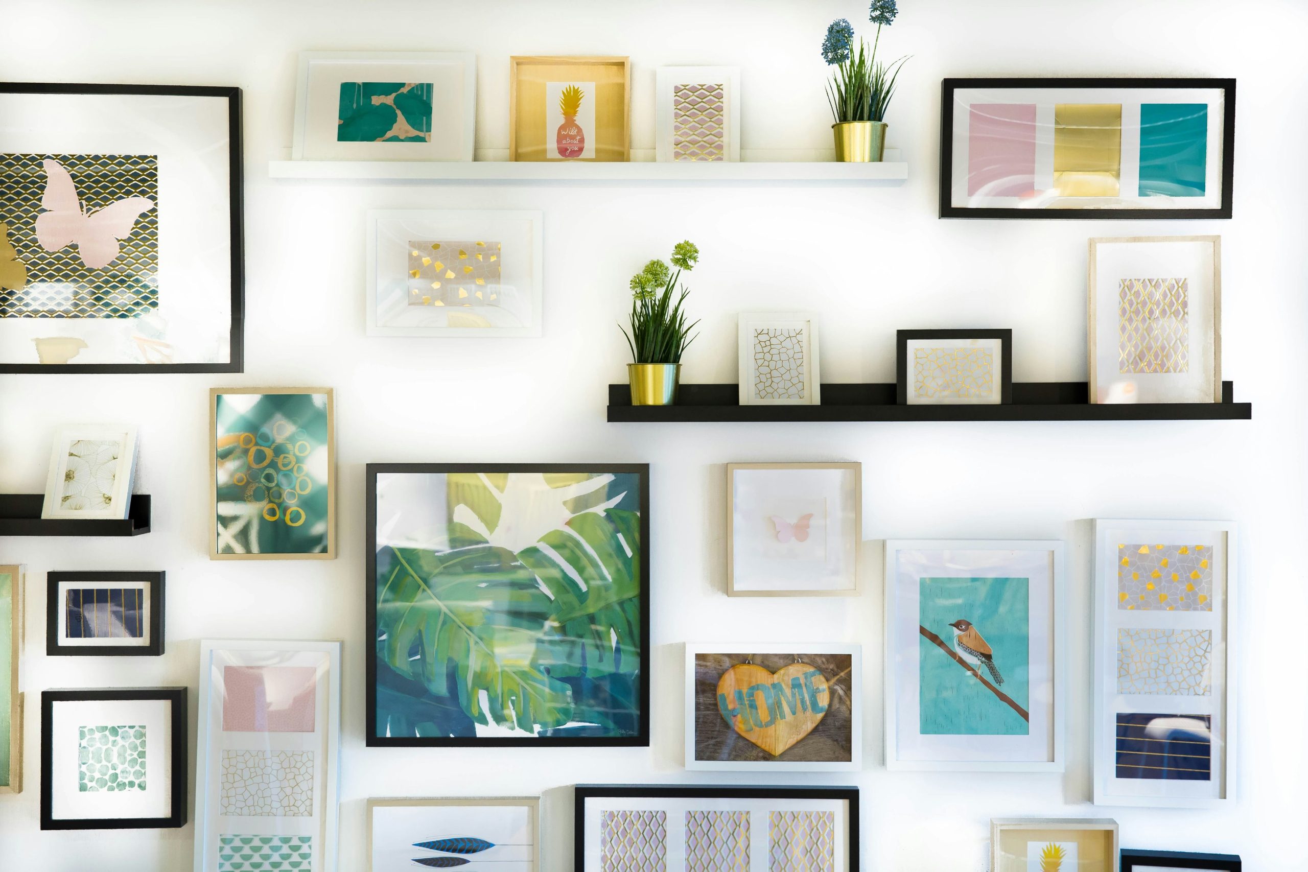
Start with one tough image, order a small proof, and iterate. Two or three passes are all it takes to lock in a workflow you can trust—then scale it to a full gallery wall.